About Printing, and Viewing your Prints
May 26, 2020
Take Your Time
If you’ve done darkroom printing in either B&W or color, you know it’s not a quick process. Most of the darkroom processes I used required a drying time for the prints, which meant big delays until you finally got to critically evaluate the result. And if you were not happy with the first result (which was typical), you carefully considered how you could make the print look better. When I did the Dye Transfer color process, I would consider over a period of several days what I would do to make a better print. When I took my time, the 2nd print I made was usually an improvement.
Nowadays, with inkjet printers, you can get a finished print in minutes! How exciting— except when I quickly make that second print, I often make it worse! I realized that I needed to slow down, to carefully consider the changes I was going to make.
When I now print my work, or when I advise people in my workshops, I recommend working on at least 2 or three images at a time. This will slow you down. Because here’s what I usually experience: After working up an image on the monitor, and then making the first proof print, I am usually a little disappointed in the result. I think this is because images usually look better on the monitor! The monitor has a bigger dynamic range than a print—it glows. And it’s hard to compete with that. But, before deciding how that first print could be improved, I move on to another image. I work that up and make a print of it. And again, I am a little disappointed. But, when I then look at that first print, I always think, “well, that’s not so bad!” I can now see that first print with fresh eyes, and am in a better position to consider how to improve it.
So slow down and take time in considering how you can make a print look better. Work with more than one image at a time.
A Dedicated Place to View Prints
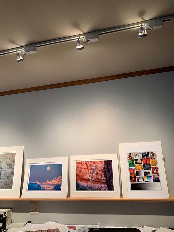
Having a dedicated area where you can display prints is incredibly valuable. Using a rail or shelf illuminated by track lighting is the perfect way to display and evaluate your prints. I prefer a long rail, as seeing many prints together is incredibly helpful, especially with ferreting out any color balance problems. A permanent rail like this will be one of the best investments you can make to improve your photography! As I discussed above, figuring out how to improve a print should take some time, and having a place where you can see that proof print over a period of time is vital. Often, just passing by the print during the day will get your unconscious working on it—and then sometimes you'll say "Aha! Now I know how to make it better..."
The intensity of this light is also critical. If it’s too bright, then your prints will look too dark under typical gallery conditions. If you have a spotmeter (I've got one from my film days), meter a piece of white matboard (I use Rising white). An excellent result would be a reading of around 10 to 11 EV (at 100 ISO). One can also use a camera to take such a reading. You will need to fill the frame with the white matboard, making sure you’re not casting any shadows! If your ISO is set to 100, and your aperture to f8, then the shutter speed should read around 10th to 15th of a second.
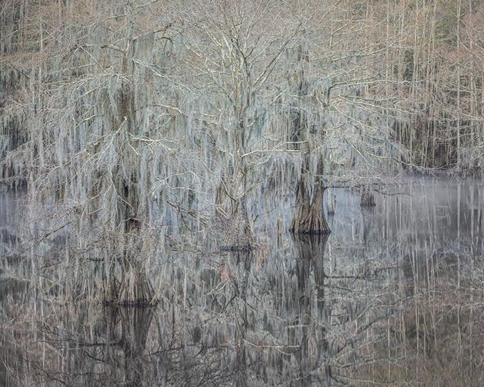
The image above shows a part of my print shelf. Also notice that I put the prints in white mats (which I've made to be reusable), as this will change your perception of the print slightly! This will make the prints look slightly darker. It's the most perceptually accurate way.
LEDs for viewing prints
As of late 2014, I have switched out my tungsten/halogen bulbs in favor of LEDs made by Soraa. Soraa has a technology that creates excellent color, with a color rendering index of 95. I recommend Soraa bulb 00943. The specs for this are: Vivid Par30L, 2700K, 7.5 Watts, CRI 95, 36 degree beam spread, 410 Lumens. I recommend the 2700 degree Kelvin color temperature, which closely matches Tungsten-halogen bulbs. For a slightly brighter bulb (60 watt halogen equivalent), you would want model 00963, which is 9 watts. I find that spacing the fixtures about 18 inches apart will give nicely even light.
I recommend using 2700 Kelvin for the color temperature, because that is how your print will be seen 98% of the time. (OK, I made that up :-) ). I know of no gallery that uses the 5000K, or 4700 bulbs—they are much too blue! With LEDs you can choose amongst various color temperatures, like 3000K, or 3400K. But I hear most LEDs sold are 2700K, because people want the light that they're used to with tungsten or tungsten/halogen bulbs. Which is 2700K. One of the great things about LEDs is you can dim them, and not change the color temperature!
My setup at home uses MR-16 bulbs, which are made for light fixtures that have built-in transformers that convert the 120 track voltage to 12 volts. You need a fixture that has a transformer that can work with the low wattage the LEDs use. I'm using Halo track, with a WAC Lighting HHT-160-WT H Series Low Voltage Track Head, 50W. Buy these fixtures without bulbs (if possible), because you're going to use Soraa bulbs. It's helpful to consult a l local business that specializes in track lighting.
Again, that's Soraa 777056 SM16-07-36D-927-03 Vivid MR16 GU5.3 7.5W 2700K 36 Degree LED Light Bulb. and the track is 30 inches from the wall. The 9 watt bulbs I find too bright for this situation, with an 8 foot ceiling. I like to be able to put various size prints without worrying about hot spots. This is why I put a fixture every 18 inchesand chose the 36 degree floods, and used 7.5 watts. A great test is to line up white mount board and adjust the lights so it's fairly even across.
These bulbs may be, amazingly, hard to get in California, because they don't exactly fit some recent regulations. But these are LEDs! I was able to get some recently through Amazon.