This is the lecture I gave during the OnLandscape “Meeting of the Minds” conference in 2016. When I was teaching I gave many presentations like this, and I covered a little of my history, how I got into photography, and some of my trips to Australia.
Also, how I met some wonderful photographers like Ansel Adams and Don Worth. Then I discuss “the Tyranny of the New” and the wonderful book, “Vision and Art: The Biology of Seeing” by Margaret Livingstone, and why printing your images can lead to better images.
Finally, some musical tributes to Worth and Adams, then I'm interviewed by David Ward. WARNING! This lecture is more than an hour, and may induce sleepiness. Enjoy.
Here's a piano recording I made in 2006 of a Scarlatti Sonata using my Mason & Hamlin piano. It was recorded in a Church that had very little carpeting but lots of stone, so the acoustics are wonderfully reverberant. This piece was popularized in the “Switched On Bach” recordings back in the 60s. Also, a favorite of one of my favorite pianists, Vladimir Horowitz. So I’ve loved this piece for a long time. Scarlatti spent most of his life in service to Portuguese and Spanish Royal families, and so there are echoes of the pomp and flourishes he heard there. Very Regal! Please enjoy.
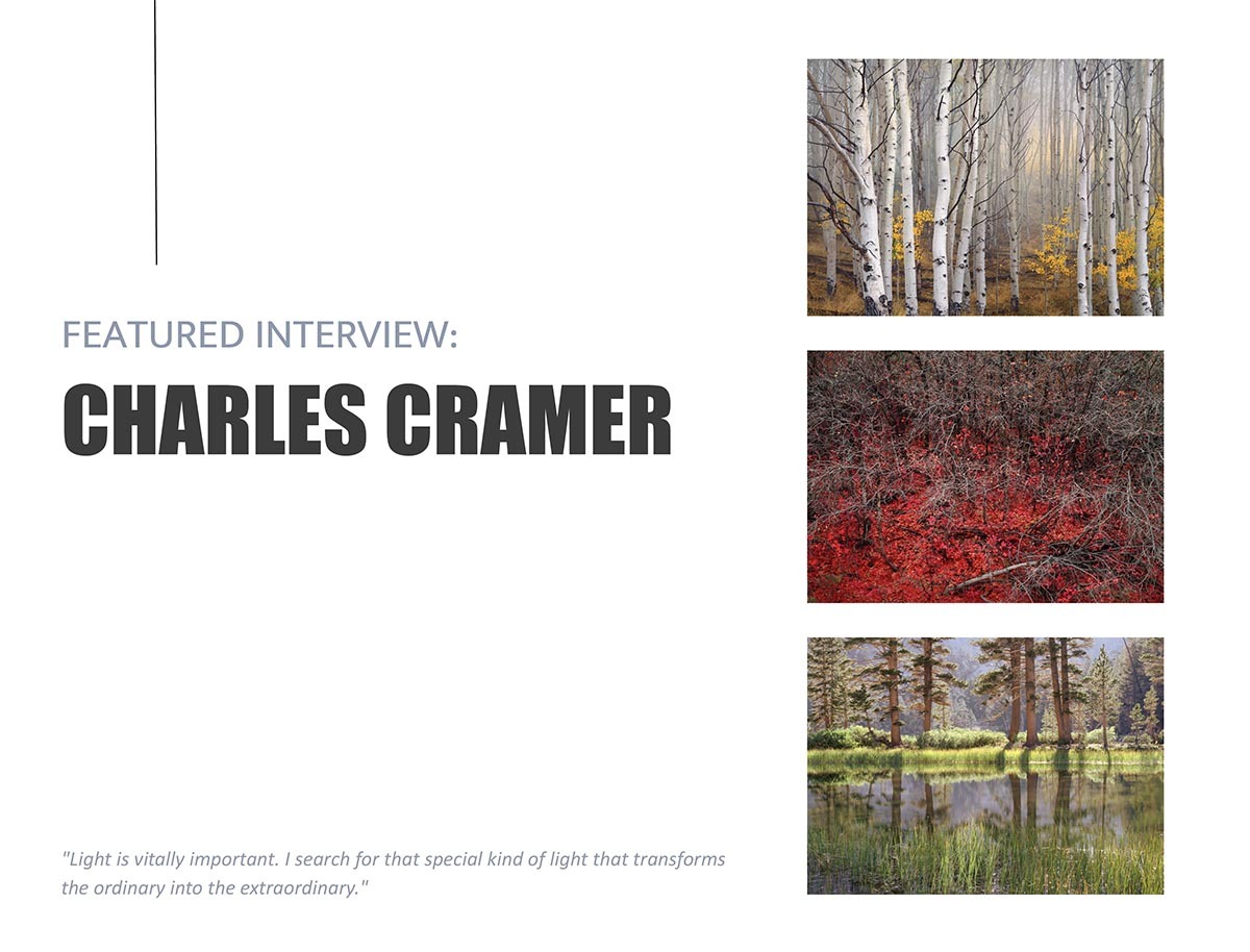
I was delighted to be included in the December "Celebrating the Print" issue in the online magazine Elements. But my "delight" meter has spiked, since I am the "featured" photographer in the February issue! The editors developed a series of questions based on various things that I've written over the years. It's quite comprehensive, and includes many of my favorite photos plus a few that have never seen the light of day. In the interview, one of the subjects concerns editing one's work. I find this very difficult. Perhaps because I feel most of my images should never see the light of day! But I also discuss how this is probably true of most photographers. (I also discuss the case of Ansel Adams in this regard).
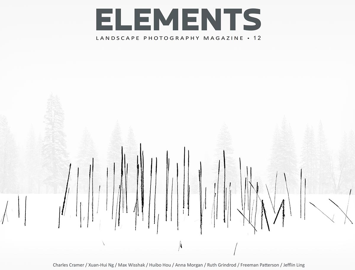
Elements Magazine can be found here. As you probably know, most photographic magazines are 60-70% advertisements! Elements has none, and contains 100+ pages of content.
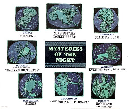
This is a recording I did in 2006 on my Mason & Hamlin piano. It is a quiet and wonderful piece. I first heard it on an album entitled "Mysteries of the Night" released in the 60s. Clair de Lune here was arranged for guitar. But I liked it so much that it's one of the few vinyl records that I have I kept all these years. I remember one of my earlier piano teachers called it "Clear the Saloon." Of course, once I mention that, it will be hard for you to forget. But, pay no attention to me!
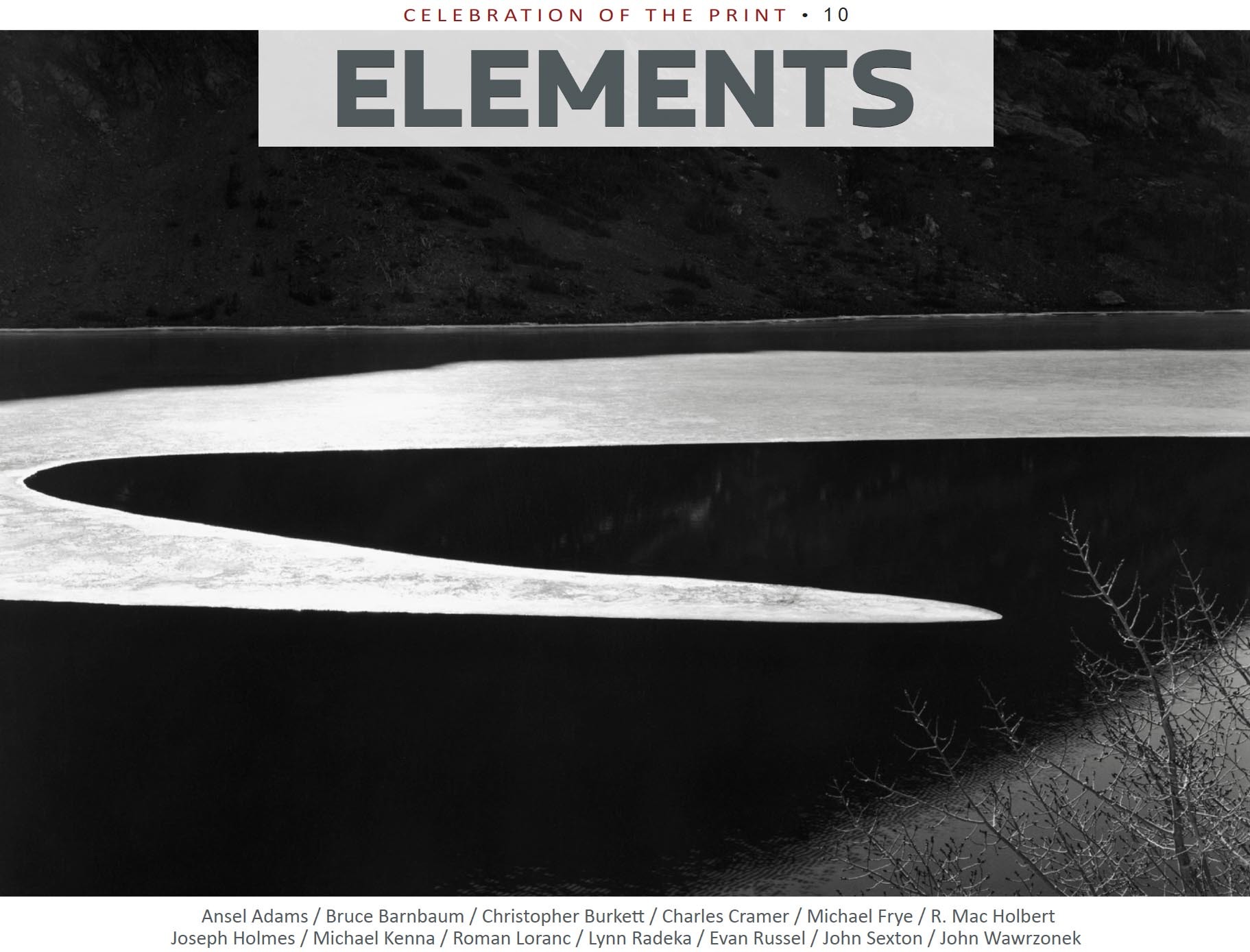
I'm honored that I will be one of the photographers in this special issue of Elements Online Magazine. It's called "CELEBRATION OF THE PRINT." Each photographer has selected three images to show, and answered various questions about print making. Some of the other photographers included are Ansel Adams, John Sexton, Joseph Holmes, Michael Kenna, and many others.
ELEMENTS is a monthly online publication that focuses (pun intended) on landscape photography. The publisher has created a special discount coupon for readers of this blog. Use the code CHARLES10 to receive a 10% discount on an annual subscription of 12 issues. You can learn more about ELEMENTS, and subscriptions at Elements Photo Magazine. This special issue goes live on Dec. 4th.
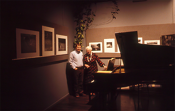
In 2010, I was absolutely thrilled to be asked to have a one-man exhibition at the Center for Photographic Art. In the video, I explain the venerable history of this gallery. Since this was a huge show, I wanted to create a video of the exhibition, so I could remember it and share it with others. The gallery is exquisitely appointed, with wonderful lighting and excellent layout.
I’d like to thank Jim Kasson, a friend and a benefactor of this gallery for sponsoring the show. Also, the many people who volunteered to help hang the show—an immense undertaking!
The CPA is still going strong, even during the last few trying years. They are a wonderful resource for photographers, and others who just appreciate the arts. Their website is found at a URL that is the envy of many! So simple, and to the point: www.photography.org.
Thanks for viewing my video and please consider supporting the Center.
(Don't worry—the sound doesn't start until about 9 seconds in)
Brent Heisinger is a superb musician that I met when I was a music major at San Jose State many moons ago. His specialty is composition and has an impressive catalog of compositions for various ensembles.
I often attended concerts by the San Jose Chamber Orchestra, who have performed many of Heisinger’s pieces. In 2012, he wrote a short piano piece and enlisted one of the piano faculty at San Jose State University, Gwen Mok to play and record it. He wanted to create a video with some images of the natural scene. Although I didn’t routinely create videos, I knew enough to do some rudimentary editing.
Brent had definite ideas about what it should look like, and we met several times to work on it. One of his ideas involved blending some closeups of Dr. Mok’s hands into the video, and we met at Mok’s studio to tape that.
This piece has many wonderful mood changes, which Dr. Mok performed to perfection. I am very happy with the finished result.
Mozart’s Come Scoglio, from Cosi fan tutte, with Rebecca Basilio, soprano
As a music major in College majoring in piano, one gets called on to do lots of accompanying. This means playing the piano part for various instrumentalists, singers, and others. Later, at Eastman, I played with a string quartet, and other ensembles. But, one of the best singers I ever accompanied was Rebecca Basilio.
Now, a diversion to explain what follows....
Attending the Ansel Adams Yosemite workshop in 1977, I got to know Ansel a tiny bit. I’m a little shy, but through the help of one of the people also attending this workshop (Ron Bentley, from Australia), I got to know Ansel much better. Ron was already a friend of Ansel’s. When Ron later visited this country, he usually also went to Carmel to see Ansel, and he started inviting me for such visits. Ansel learned that I was also a pianist, and for his Birthday in 1984, his staff asked the famous Russian pianist, Vladimir Ashkenazy to play for the party (and he did previously in 1982). There were only about 75 seats for this, so seating was at a premium. Amazingly, I was invited! I later learned that his staff was very upset about this, as there were many more important people that got bumped! But, I think Ansel figured I was a pianist, and so I should come and hear this incredible pianist.
It was an amazing experience, in many ways. When I arrived (April 22, 1984), they announced that Ansel was actually in the hospital. But Ansel wanted the party to continue, he was feeling much better, and Ashkenazy did perform. I was on cloud nine! But, when I woke up the next morning, the news shows announced that Ansel had died late the previous night. What a terrible shock!
On reflection, I think that was just like Ansel. He thought of all of us first, and held on to not spoil the party.
About a year later, I rather audaciously offered Virginia, his widow, to do a piano recital for her. Amazingly—she accepted, and said that this would be the first social event she had hosted since Ansel died. It was thrilling to play on this incredible Mason & Hamlin piano. Mason & Hamlin is not a big name now, but back when Ansel was planning on devoting his life to the piano, his family bought one in 1925—because it was considered one of the very best. That is the piano I got to play. Unfortunately, I did not record this recital. But, I did get a photo!
Back to the originally scheduled post....
After this, I told Virginia that I knew an incredible soprano, and that we could do a Mother’s Day recital for her (Virginia was a singer in her youth). And what you’ll hear is one of the pieces from that recital.
Fortunately, I did record this recital, but there are no photos, of course! I set the recorder back in Ansel’s office, and put the mics in what turned out to be a decent position. With a soprano like Rebecca, she can produce a big sound, and the balance with the piano can be a problem. But, this recording is not too bad sound-wise. And you get to hear Ansel’s beloved Mason & Hamlin.
It is estimated that Ansel Adams produced 40-50,000 negatives during his lifetime—an amazing amount of work. But, how many of these did Ansel print? And how many of those ended up as what he called his “Mona Lisas”?
When I took my first Ansel Adams workshop in 1977, I was convinced that anything that Ansel photographed would be magical—his powers were so refined by decades of experience that his every exposure was a masterpiece. I gradually learned that was not the case! In fact, of those 50,000 negatives, I’ve heard estimates that 400-500 different images have been published. That’s 1 percent. Ansel himself said that making twelve meaningful photographs a year is good production.
Don Worth, one of Ansel’s first assistants, told me that one of his jobs was to make some new proofs of all of Ansel’s 8x10 negatives of Yosemite. He said that he was amazed…that so many of them were just “record” shots. In other words, images that are mostly devoid of emotional content.
I feel better already—because that describes most of my images! If this is the case, how do we mere mortals go about figuring out which of our images go beyond being mere “record” shots? I think it is especially difficult with landscape work.
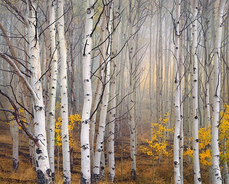
Aspen in Fog, Boulder Mountain, Utah 2003
What Is Best?
First, I think we need to ask what makes an image good or even great.
(Just google “What is Art” and get back to me…) What I go by is—does
the image elicit some positive emotional response? Some images just
make us go “oohhh." Some just resonate with people.
Because, why would a prudent and sane person go into a gallery and
walk out having plopped down 500 hard-earned dollars for a photograph?
It’s because they had a strong reaction to the image. It got to
them on some level. It created an emotional response. So, how can we
determine which of our images create such a response?
Finding Your Best
First, the photographer who makes the image is not necessarily a good judge. Just because you had to hike 20 miles to get to a location does not make it a better image than one found right along the road. The viewer of the photograph does not know any of that. The viewer only sees what is presented in the image. I remember Don Worth saying that, before selecting which images to print, he’d like to even forget taking them. Then you can be objective!
I find that having other people review my images is a great help. But, we can’t ask them to look at 10,000 of our images and then select their favorites. The photographer will have to do a first or second edit to narrow down the choices to a workable amount. And software like Lightroom makes this much easier. I have learned to trust my initial edits to some degree. But I always go back and “tweak” every image a little, so every image looks presentable. And then go through them all again to search for “sleepers." I still go back every once in a while to review older images. I’ve heard it said that our conscious mind lags behind the subconscious. So some images we make we don’t quite understand yet—but will in the future. I’ve found a few good sleepers over the years…
When friends visit, I usually ask them to give me feedback on some images. But, I don’t ask them which is the best. I ask which is their favorite. I want to know which ones “get” to them. In workshops, after a print critique, I’ll tell the group, “Mary has graciously agreed to give everyone two prints of their choice!” Mary hasn’t really agreed to this—but I want the students to think about which of Mary’s prints mean something to them. Which of these prints would they like to have on their walls at home? That’s a very different question than just asking which is the best. This question gets people to think about how they respond to these images on a personal level.
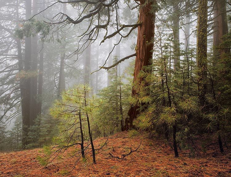
Trees in Fog, Wawona Road, Yosemite 1982
Does Popularity Equal Best?
Years ago, a friend and I agreed to trade prints. He asked, “which are your bestsellers?” I initially thought this was not a good way to judge the merit of one’s images. But now, I think he might be on to something. Above is the print that has sold the most for me, “Trees in Fog, Wawona Road, Yosemite." When I recently traded images with two photographers I really respect, I was very surprised when they both choose this image.
Another friend who is a very fine photographer had a feature on his website where people could choose their favorite images. When he did an analysis of which got the most votes, he was very disappointed. He said any image with a snowy mountain peak was at the top of the list! But I wonder if web-surfers are a different demographic than the people who feel strongly enough to actually pay a lot of money for a print? I would hope so. Either that, or “Trees in Fog” has pleasing colors that match lots of sofas!
Since my wonderful Web Designer made it possible, I have uploaded an mp3 file that I recorded in 2012. I can’t believe I actually played this, because it involves a very awkward left hand part. Sergei Rachmaninoff had very large hands, and took advantage of that fact often. I think this is one case where it was easy for him, but very awkward for mere mortals like me.
Anyway, I also had the advantage of being able to do multiple takes,
and if I didn’t play something right the first time, I could try it
again. Then combining them until I was happy.
This is Rachmaninoff’s Etude-Tableau No. 2 from the Op. 33 set. One of my favorite pieces.
If you don’t like this, then blame my web designer! Just kidding— I take full responsibility!