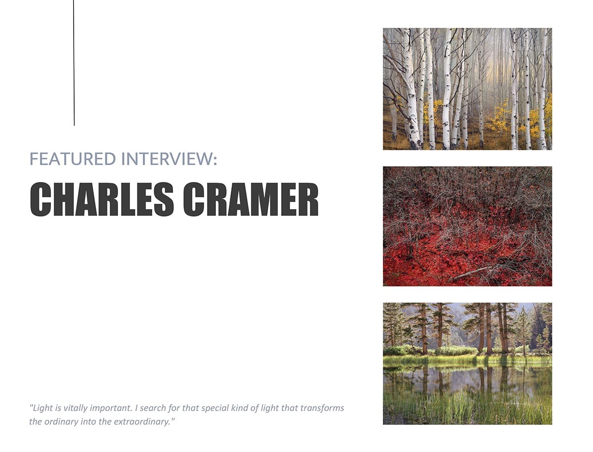
I was delighted to be included in the December "Celebrating the Print" issue in the online magazine Elements. But my "delight" meter has spiked, since I am the "featured" photographer in the February issue! The editors developed a series of questions based on various things that I've written over the years. It's quite comprehensive, and includes many of my favorite photos plus a few that have never seen the light of day. In the interview, one of the subjects concerns editing one's work. I find this very difficult. Perhaps because I feel most of my images should never see the light of day! But I also discuss how this is probably true of most photographers. (I also discuss the case of Ansel Adams in this regard).
Elements Magazine can be found here. As you probably know, most photographic magazines are 60-70% advertisements! Elements has none, and contains 100+ pages of content.
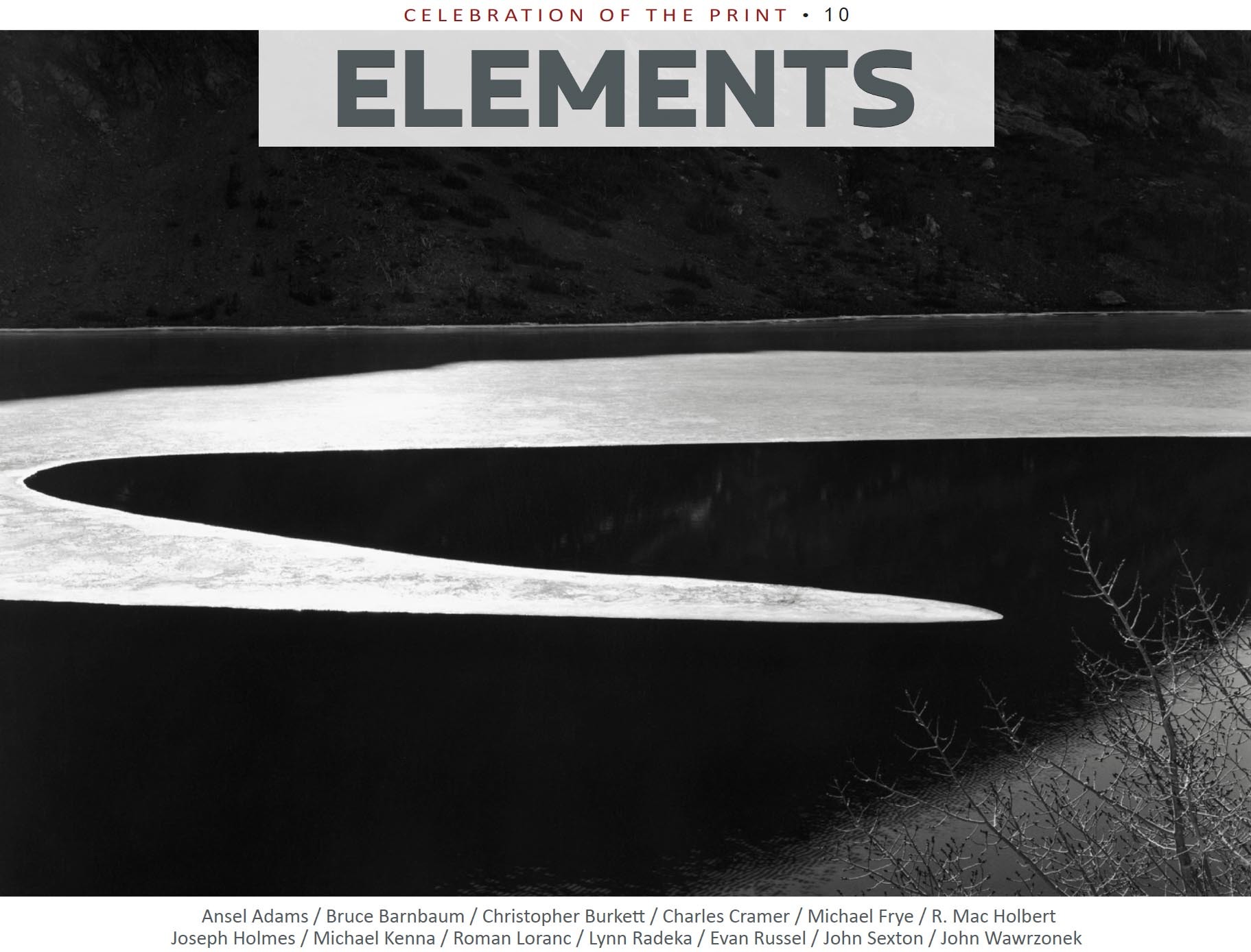
I'm honored that I will be one of the photographers in this special issue of Elements Online Magazine. It's called "CELEBRATION OF THE PRINT." Each photographer has selected three images to show, and answered various questions about print making. Some of the other photographers included are Ansel Adams, John Sexton, Joseph Holmes, Michael Kenna, and many others.
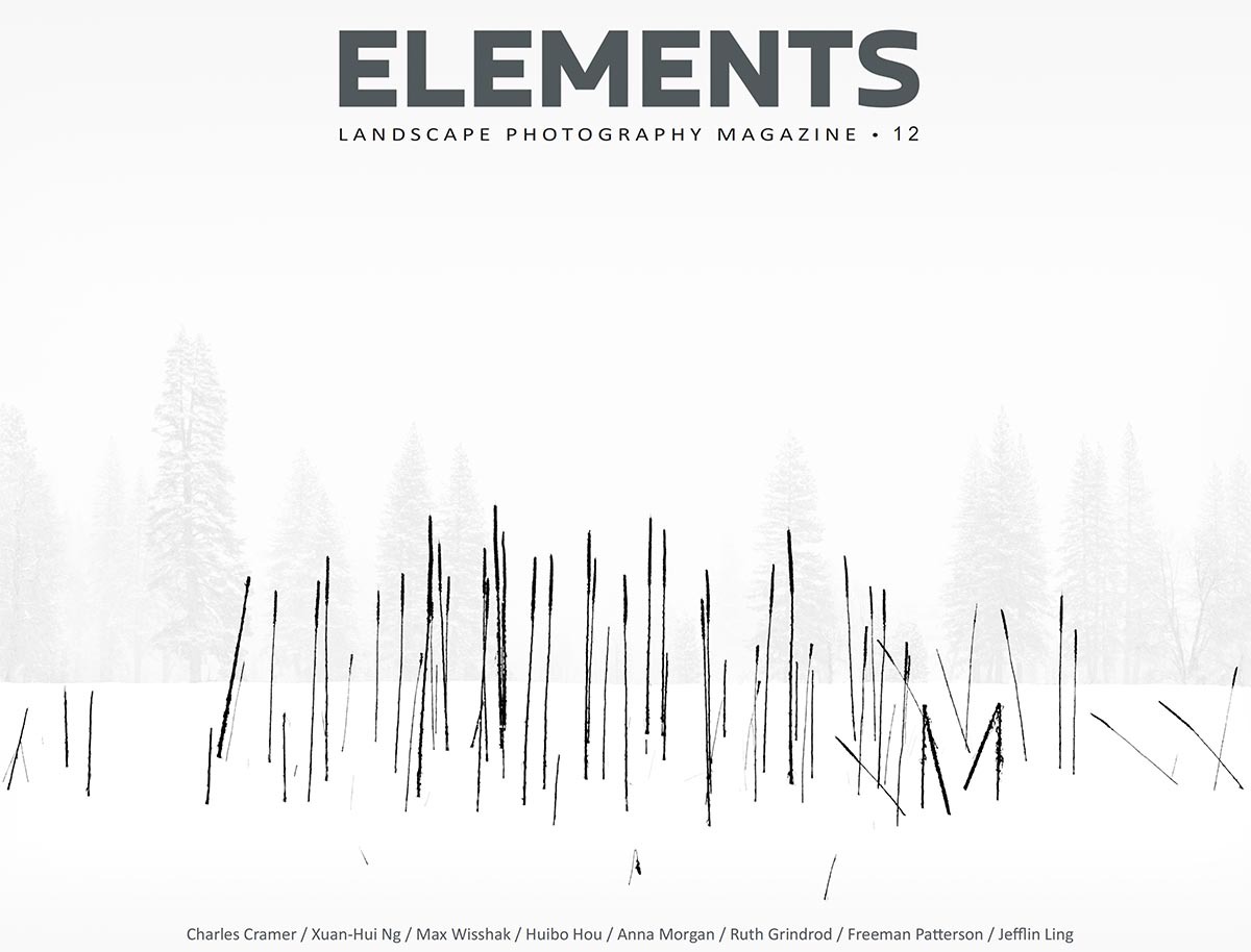
ELEMENTS is a monthly online publication that focuses (pun intended) on landscape photography. The publisher has created a special discount coupon for readers of this blog. Use the code CHARLES10 to receive a 10% discount on an annual subscription of 12 issues. You can learn more about ELEMENTS, and subscriptions at Elements Photo Magazine. This special issue goes live on Dec. 4th.
It is estimated that Ansel Adams produced 40-50,000 negatives during his lifetime—an amazing amount of work. But, how many of these did Ansel print? And how many of those ended up as what he called his “Mona Lisas”?
When I took my first Ansel Adams workshop in 1977, I was convinced that anything that Ansel photographed would be magical—his powers were so refined by decades of experience that his every exposure was a masterpiece. I gradually learned that was not the case! In fact, of those 50,000 negatives, I’ve heard estimates that 400-500 different images have been published. That’s 1 percent. Ansel himself said that making twelve meaningful photographs a year is good production.
Don Worth, one of Ansel’s first assistants, told me that one of his jobs was to make some new proofs of all of Ansel’s 8x10 negatives of Yosemite. He said that he was amazed…that so many of them were just “record” shots. In other words, images that are mostly devoid of emotional content.
I feel better already—because that describes most of my images! If this is the case, how do we mere mortals go about figuring out which of our images go beyond being mere “record” shots? I think it is especially difficult with landscape work.
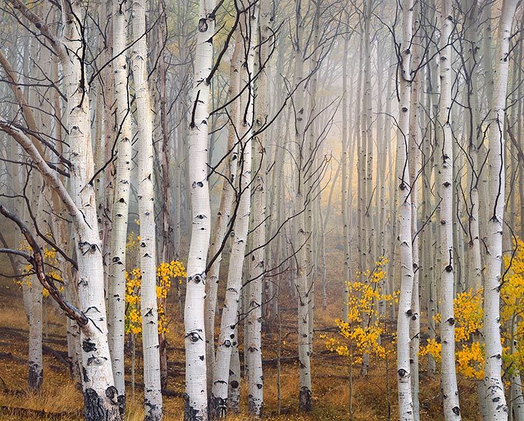
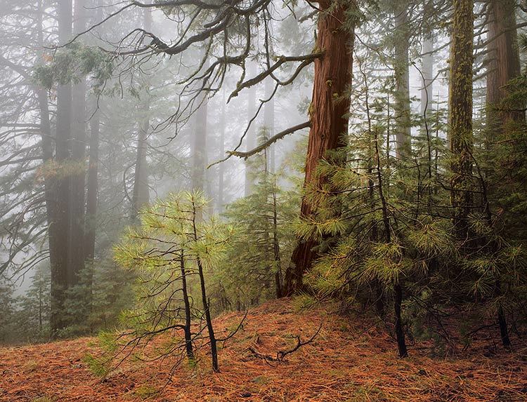
Aspen in Fog, Boulder Mountain, Utah 2003
What Is Best?
First, I think we need to ask what makes an image good or even great.
(Just google “What is Art” and get back to me…) What I go by is—does
the image elicit some positive emotional response? Some images just
make us go “oohhh." Some just resonate with people.
Because, why would a prudent and sane person go into a gallery and
walk out having plopped down 500 hard-earned dollars for a photograph?
It’s because they had a strong reaction to the image. It got to
them on some level. It created an emotional response. So, how can we
determine which of our images create such a response?
Finding Your Best
First, the photographer who makes the image is not necessarily a good judge. Just because you had to hike 20 miles to get to a location does not make it a better image than one found right along the road. The viewer of the photograph does not know any of that. The viewer only sees what is presented in the image. I remember Don Worth saying that, before selecting which images to print, he’d like to even forget taking them. Then you can be objective!
I find that having other people review my images is a great help. But, we can’t ask them to look at 10,000 of our images and then select their favorites. The photographer will have to do a first or second edit to narrow down the choices to a workable amount. And software like Lightroom makes this much easier. I have learned to trust my initial edits to some degree. But I always go back and “tweak” every image a little, so every image looks presentable. And then go through them all again to search for “sleepers." I still go back every once in a while to review older images. I’ve heard it said that our conscious mind lags behind the subconscious. So some images we make we don’t quite understand yet—but will in the future. I’ve found a few good sleepers over the years…
When friends visit, I usually ask them to give me feedback on some images. But, I don’t ask them which is the best. I ask which is their favorite. I want to know which ones “get” to them. In workshops, after a print critique, I’ll tell the group, “Mary has graciously agreed to give everyone two prints of their choice!” Mary hasn’t really agreed to this—but I want the students to think about which of Mary’s prints mean something to them. Which of these prints would they like to have on their walls at home? That’s a very different question than just asking which is the best. This question gets people to think about how they respond to these images on a personal level.
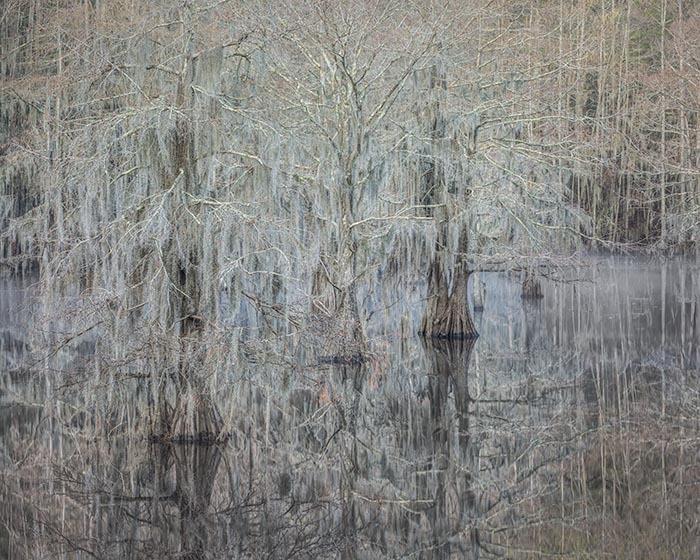
Trees in Fog, Wawona Road, Yosemite 1982
Does Popularity Equal Best?
Years ago, a friend and I agreed to trade prints. He asked, “which are your bestsellers?” I initially thought this was not a good way to judge the merit of one’s images. But now, I think he might be on to something. Above is the print that has sold the most for me, “Trees in Fog, Wawona Road, Yosemite." When I recently traded images with two photographers I really respect, I was very surprised when they both choose this image.
Another friend who is a very fine photographer had a feature on his website where people could choose their favorite images. When he did an analysis of which got the most votes, he was very disappointed. He said any image with a snowy mountain peak was at the top of the list! But I wonder if web-surfers are a different demographic than the people who feel strongly enough to actually pay a lot of money for a print? I would hope so. Either that, or “Trees in Fog” has pleasing colors that match lots of sofas!
If you’ve done darkroom printing in either B&W or color, you know it’s not a quick process. Most of the darkroom processes I used required a drying time for the prints, which meant big delays until you finally got to critically evaluate the result. And if you were not happy with the first result (which was typical), you carefully considered how you could make the print look better. When I did the Dye Transfer color process, I would consider over a period of several days what I would do to make a better print. When I took my time, the 2nd print I made was usually an improvement.
Nowadays, with inkjet printers, you can get a finished print in minutes! How exciting— except when I quickly make that second print, I often make it worse! I realized that I needed to slow down, to carefully consider the changes I was going to make.
When I now print my work, or when I advise people in my workshops, I recommend working on at least 2 or three images at a time. This will slow you down. Because here’s what I usually experience: After working up an image on the monitor, and then making the first proof print, I am usually a little disappointed in the result. I think this is because images usually look better on the monitor! The monitor has a bigger dynamic range than a print—it glows. And it’s hard to compete with that. But, before deciding how that first print could be improved, I move on to another image. I work that up and make a print of it. And again, I am a little disappointed. But, when I then look at that first print, I always think, “well, that’s not so bad!” I can now see that first print with fresh eyes, and am in a better position to consider how to improve it.
So slow down and take time in considering how you can make a print look better. Work with more than one image at a time.
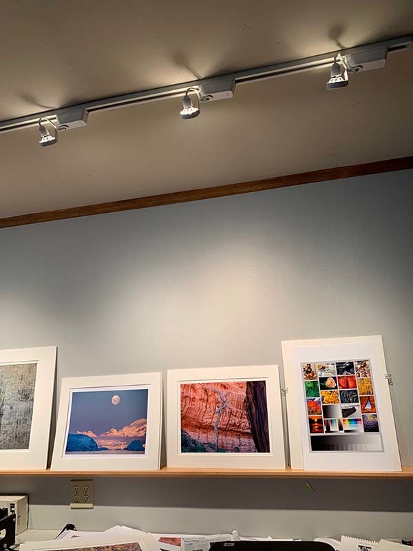
My Print Viewing Area, Now with LEDs
A Dedicated Place to View Prints
Having a dedicated area where you can display prints is incredibly valuable. Using a rail or shelf illuminated by track lighting is the perfect way to display and evaluate your prints. I prefer a long rail, as seeing many prints together is incredibly helpful, especially with ferreting out any color balance problems. A permanent rail like this will be one of the best investments you can make to improve your photography! As I discussed above, figuring out how to improve a print should take some time, and having a place where you can see that proof print over a period of time is vital. Often, just passing by the print during the day will get your unconscious working on it—and then sometimes you'll say "Aha! Now I know how to make it better..."
The intensity of this light is also critical. If it’s too bright, then your prints will look too dark under typical gallery conditions. If you have a spotmeter (I've got one from my film days), meter a piece of white matboard (I use Rising white). An excellent result would be a reading of around 10 to 11 EV (at 100 ISO). One can also use a camera to take such a reading. You will need to fill the frame with the white matboard, making sure you’re not casting any shadows! If your ISO is set to 100, and your aperture to f8, then the shutter speed should read around 10th to 15th of a second.
The image above shows a part of my print shelf. Also notice that I put the prints in white mats (which I've made to be reusable), as this will change your perception of the print slightly! This will make the prints look slightly darker. It's the most perceptually accurate way.
LEDs for viewing prints
As of late 2014, I have switched out my tungsten/halogen bulbs in favor of LEDs made by Soraa. Soraa has a technology that creates excellent color, with a color rendering index of 95. I recommend Soraa bulb 00943. The specs for this are: Vivid Par30L, 2700K, 7.5 Watts, CRI 95, 36 degree beam spread, 410 Lumens. I recommend the 2700 degree Kelvin color temperature, which closely matches Tungsten-halogen bulbs. For a slightly brighter bulb (60 watt halogen equivalent), you would want model 00963, which is 9 watts. I find that spacing the fixtures about 18 inches apart will give nicely even light.
I recommend using 2700 Kelvin for the color temperature, because that is how your print will be seen 98% of the time. (OK, I made that up :-) ). I know of no gallery that uses the 5000K, or 4700 bulbs—they are much too blue! With LEDs you can choose amongst various color temperatures, like 3000K, or 3400K. But I hear most LEDs sold are 2700K, because people want the light that they're used to with tungsten or tungsten/halogen bulbs. Which is 2700K. One of the great things about LEDs is you can dim them, and not change the color temperature!
My setup at home uses MR-16 bulbs, which are made for light fixtures that have built-in transformers that convert the 120 track voltage to 12 volts. You need a fixture that has a transformer that can work with the low wattage the LEDs use. I'm using Halo track, with a WAC Lighting HHT-160-WT H Series Low Voltage Track Head, 50W. Buy these fixtures without bulbs (if possible), because you're going to use Soraa bulbs. It's helpful to consult a l local business that specializes in track lighting.
Again, that's Soraa 777056 SM16-07-36D-927-03 Vivid MR16 GU5.3 7.5W 2700K 36 Degree LED Light Bulb. and the track is 30 inches from the wall. The 9 watt bulbs I find too bright for this situation, with an 8 foot ceiling. I like to be able to put various size prints without worrying about hot spots. This is why I put a fixture every 18 inchesand chose the 36 degree floods, and used 7.5 watts. A great test is to line up white mount board and adjust the lights so it's fairly even across.
These bulbs may be, amazingly, hard to get in California, because they don't exactly fit some recent regulations. But these are LEDs! I was able to get some recently through Amazon.
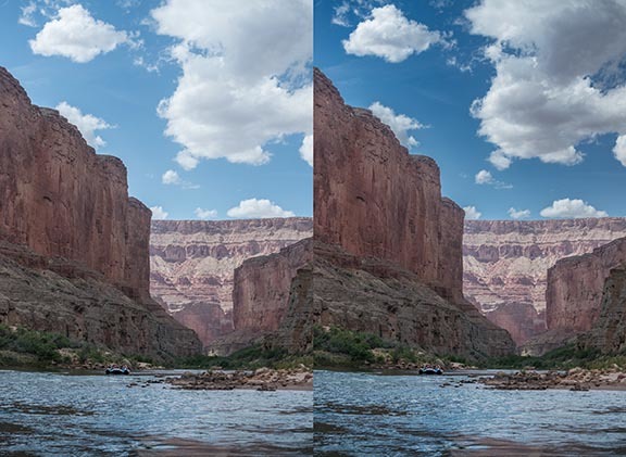
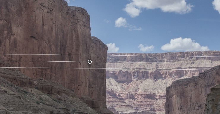
This was made on a rafting trip down the Colorado river, and another raft is visible just upstream. On the left is the image before adjustment. On the right shows after all the adjustments. This is a challenging image because it has "mixed" lighting—sun and shade. In the Before image, the shaded areas are a little dark, but mainly the clouds and sky are quite washed out.
To help the sky and clouds, I’m going to propose a local adjustment. I want to give more separation in the clouds, but don’t want to slop over and darken the tops of the cliffs. Trying to paint in an accurate mask in Raw by hand never works well. A poor selection would show a halo, either with the bottom of the sky lighter, or the top of the cliffs darker (or both). We could wait and do this in Photoshop, and use the Quick Selection tool, which would give a fairly accurate mask. But using these new Range controls here would be easier, and perhaps more
accurate!
To select this area, I’ll use the Graduated filter. But I’m going to use it in a slightly different way. I need to include all the sky, and a little bit of the cliffs. I really don’t need any gradient.
To do this, start with the cursor below the sky, and drag down just a little way. It should look like the detail below. Holding the shift key down when positioning it will insure it’s completely vertical.
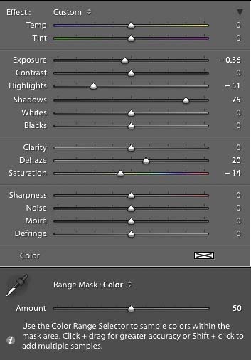
The image below shows the local adjustments I used with this graduated filter: Exposure -.36, Highlights -51, Shadows +75 (this helps lighten the sky back up), Dehaze +20, and Saturation -14 (to counteract the saturation the dehaze just added).
The Dehaze control is kind of like Clarity on steroids! It was designed to remove distant haze in images, and is very powerful! So Dehaze should be used with great care. It gives great highlight separation, but also really darkens dark tones, and can also increase saturation. It often works better as a local adjustment.
After these adjustments, you’ll notice that the top of the cliffs are darker, mainly because they’re still included in the selection! We’ll now fix this.
At the bottom of the image just above you’ll see “Range Mask: Color.” This is one of the new features available when making local adjustments. There is a choice here between Luminance and Color. (In my experience, I find the Color control more valuable). Please select “Color” and when you do, an eyedropper will appear, as you see to the left above. You must now immediately click on this dropper to select the colors you want to be affected by this new adjustment. With the dropper, you can click once on a color, or shift-click to select up to 5 different colors. I find it easier to click in the image with the dropper, hold the mouse down, and draw a box that includes all the colors you want to be affected. As soon as you do this and let up with the mouse, you’ll see that the sandstone cliffs get lighter! They’ve now been excluded from the colors that are affected. So it’s only the blue sky and white clouds that will now change. Amazing!
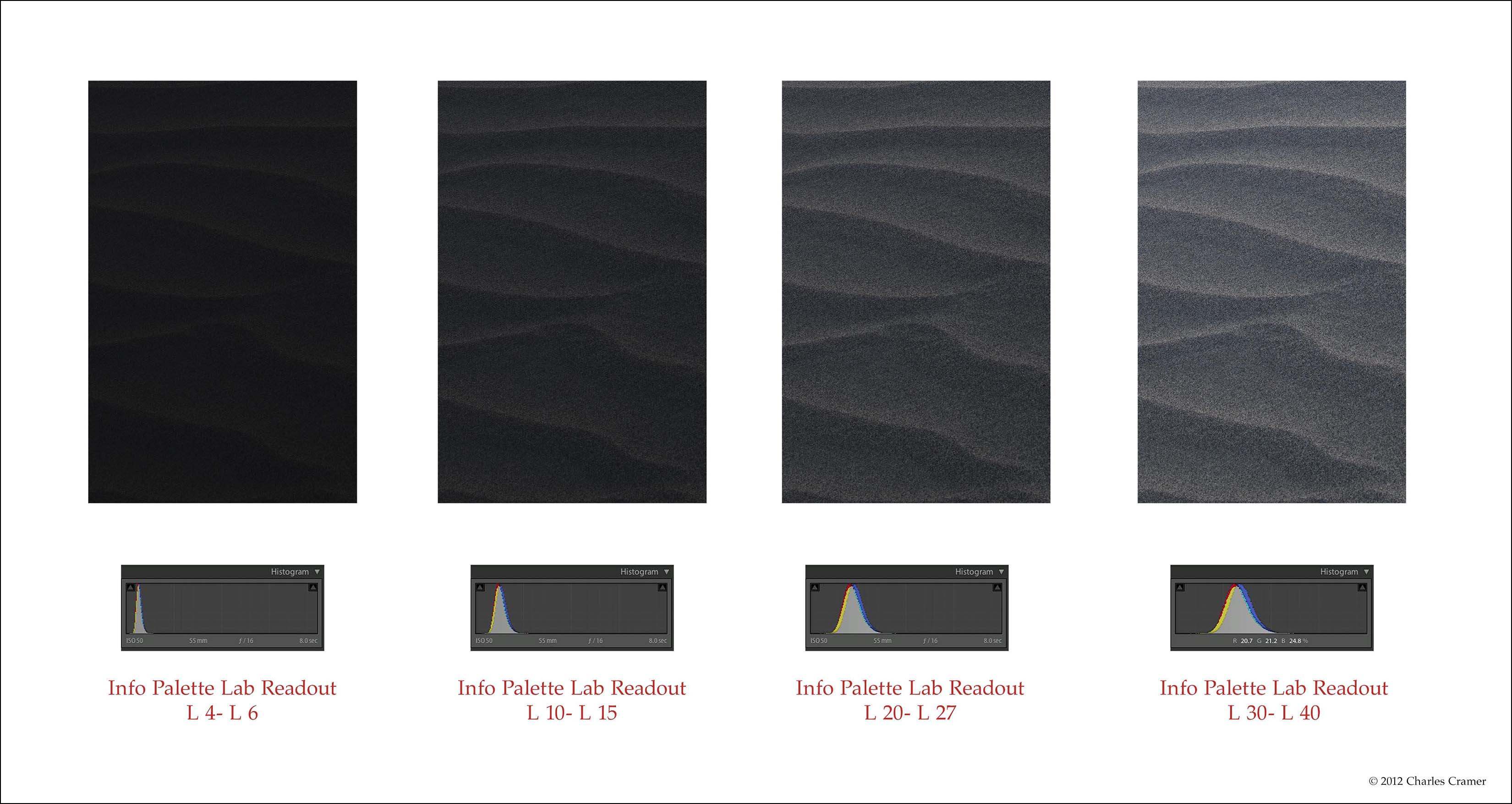
The biggest problem in making prints I hear from students is, “My prints come out too dark.” At least once a week on photographic forums, someone will ask this question. It’s not “My prints come out too light,” it’s too dark. I was also frustrated by how often my prints would, well, come out too dark! I decided to do some investigating. In 2012 I came up the the test image below which I call the “Shadow Zones Target.”
Shadow Zones
Each patch is the same sand dune detail. This was taken before the sun came up, and thus is very flat. There’s a lighter ridge, facing towards the brighter dawn sky.
And then a more shadowed section facing the darker sky in the east. I have adjusted these two tones to various levels, from very dark to almost middle grays. The darkest of these sets of patches is on the left and shows tones that read from L4 to L6. (To see Lab values: In the Develop module in Lightroom, you can right-click
(PC) or Control-click (Mac) and choose "Show Lab Values" from the menu that pops up. In Photoshop, in the Info Palette, click on one of the little eyedropper icons, and you can choose "Lab Color". Lab values read from 0 (black) to 100 (white)).
What I discovered by printing this image is that this darkest patch really doesn’t show any detail in the print. And yet, on many monitors, detail is visible. During my workshops I have students open this image on their computers, and perhaps half see detail in that darkest patch, sometimes quite a bit of detail. This is a major disconnect between what you see, and what you get! I can’t explain why this is, just that it’s often true. Open this image up and see if any detail is visible on your monitor. Then print it out and compare. (You can download this target here.)
With a well-profiled printer, it always comes out with no detail in that darkest patch. However, if you shine bright light through the print, or use Arc lamps, you might see detail. But under standard right illumination for photographs, there is basically no detail.
People often think that the solution would be to calibrate their monitor with one of the devices like the Sypder or the Xrite calibrators. Many people in my workshops have already done that, and still see this discrepancy. I have calibrated my monitor, and see the same thing. So the solution is to rely on the numbers you read in info palette, not what you see. You can’t always trust your eyes, but you can trust the numbers! And using the LAB readout makes things a little easier. My rule of thumb is any tone below L6 will print as black. On my monitor, I can see a little detail in tones of L6 tonality. But I now know that these will print as black. What I see will not match the resulting print! I have to use the eyedropper to read these dark tones so I’ll know whether or not they will print with detail.
Knowing this will help save you lots of time and paper. Because you can help eliminate a big problem—having your prints come out too dark! I also recommend viewing the images with a white surround. This will make the image look darker by comparison, and is more perceptually accurate. I discussed why this is so in my talk at the OnLandscape conference in England a few years ago. You can see the YouTube Charles Cramer talk. Jump to 35 minutes in for the white surround discussion.
Also, in my Masters video series on Luminous Landscape, I talk about the problem of dark prints in particular here. Luminous Landscape is an incredible resource. It does cost a whopping $12 a year for access. I have 26 videos up there on photographing in the field, and also quite a few on making prints.
If you want some detail in the dark tones, you have to insure that they read around L10-15 (the second set of patches). I call these tones “mysterious blacks” because they are very dark, but still show a little something going on. It almost takes a little work to see the detail—but it is there. If you want more open shadows, then we’re talking L20 and above.
Some earlier and/or cheaper monitors have a viewing angle problem, where they show different tonality depending on the angle. Moving your head left and right is usually not that bad. But moving your head up and down can make big differences, especially in the darkest tones. Try this test on your monitor so you’ll know if there is a problem. If so, then you have to rely even more on what the numbers tell you, not what you see.