My Prints Come Out Too Dark!!
September 11, 2019
Monitor vs Print
The biggest problem in making prints I hear from students is, “My prints come out too dark.” At least once a week on photographic forums, someone will ask this question. It’s not “My prints come out too light,” it’s too dark. I was also frustrated by how often my prints would, well, come out too dark! I decided to do some investigating. In 2012 I came up the the test image below which I call the “Shadow Zones Target.”
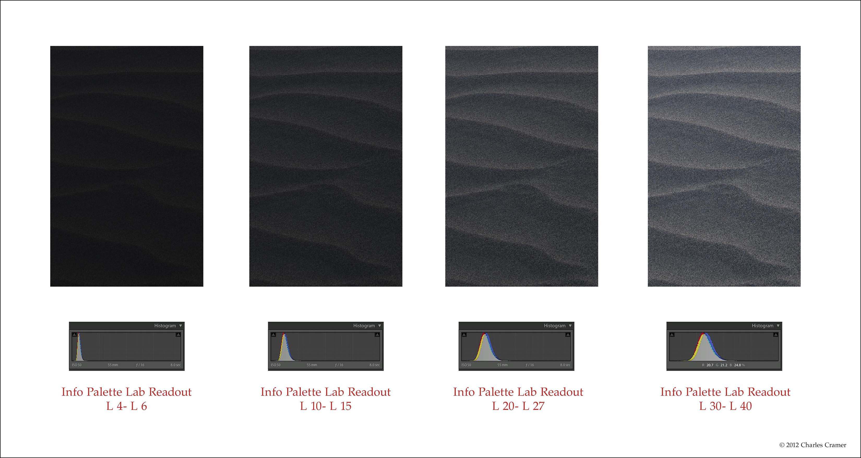
Each patch is the same sand dune detail. This was taken before the sun came up, and thus is very flat. There’s a lighter ridge, facing towards the brighter dawn sky.
And then a more shadowed section facing the darker sky in the east. I have adjusted these two tones to various levels, from very dark to almost middle grays. The darkest of these sets of patches is on the left and shows tones that read from L4 to L6. (To see Lab values: In the Develop module in Lightroom, you can right-click
(PC) or Control-click (Mac) and choose "Show Lab Values" from the menu that pops up. In Photoshop, in the Info Palette, click on one of the little eyedropper icons, and you can choose "Lab Color". Lab values read from 0 (black) to 100 (white)).
What I discovered by printing this image is that this darkest patch really doesn’t show any detail in the print. And yet, on many monitors, detail is visible. During my workshops I have students open this image on their computers, and perhaps half see detail in that darkest patch, sometimes quite a bit of detail. This is a major disconnect between what you see, and what you get! I can’t explain why this is, just that it’s often true. Open this image up and see if any detail is visible on your monitor. Then print it out and compare. (You can download this target here.)
With a well-profiled printer, it always comes out with no detail in that darkest patch. However, if you shine bright light through the print, or use Arc lamps, you might see detail. But under standard right illumination for photographs, there is basically no detail.
People often think that the solution would be to calibrate their monitor with one of the devices like the Sypder or the Xrite calibrators. Many people in my workshops have already done that, and still see this discrepancy. I have calibrated my monitor, and see the same thing. So the solution is to rely on the numbers you read in info palette, not what you see. You can’t always trust your eyes, but you can trust the numbers! And using the LAB readout makes things a little easier. My rule of thumb is any tone below L6 will print as black. On my monitor, I can see a little detail in tones of L6 tonality. But I now know that these will print as black. What I see will not match the resulting print! I have to use the eyedropper to read these dark tones so I’ll know whether or not they will print with detail.
Knowing this will help save you lots of time and paper. Because you can help eliminate a big problem—having your prints come out too dark! I also recommend viewing the images with a white surround. This will make the image look darker by comparison, and is more perceptually accurate. I discussed why this is so in my talk at the OnLandscape conference in England a few years ago. You can see the YouTube Charles Cramer talk. Jump to 35 minutes in for the white surround discussion.
Also, in my Masters video series on Luminous Landscape, I talk about the problem of dark prints in particular here. Luminous Landscape is an incredible resource. It does cost a whopping $12 a year for access. I have 26 videos up there on photographing in the field, and also quite a few on making prints.
If you want some detail in the dark tones, you have to insure that they read around L10-15 (the second set of patches). I call these tones “mysterious blacks” because they are very dark, but still show a little something going on. It almost takes a little work to see the detail—but it is there. If you want more open shadows, then we’re talking L20 and above.
Some earlier and/or cheaper monitors have a viewing angle problem, where they show different tonality depending on the angle. Moving your head left and right is usually not that bad. But moving your head up and down can make big differences, especially in the darkest tones. Try this test on your monitor so you’ll know if there is a problem. If so, then you have to rely even more on what the numbers tell you, not what you see.